




Introduction
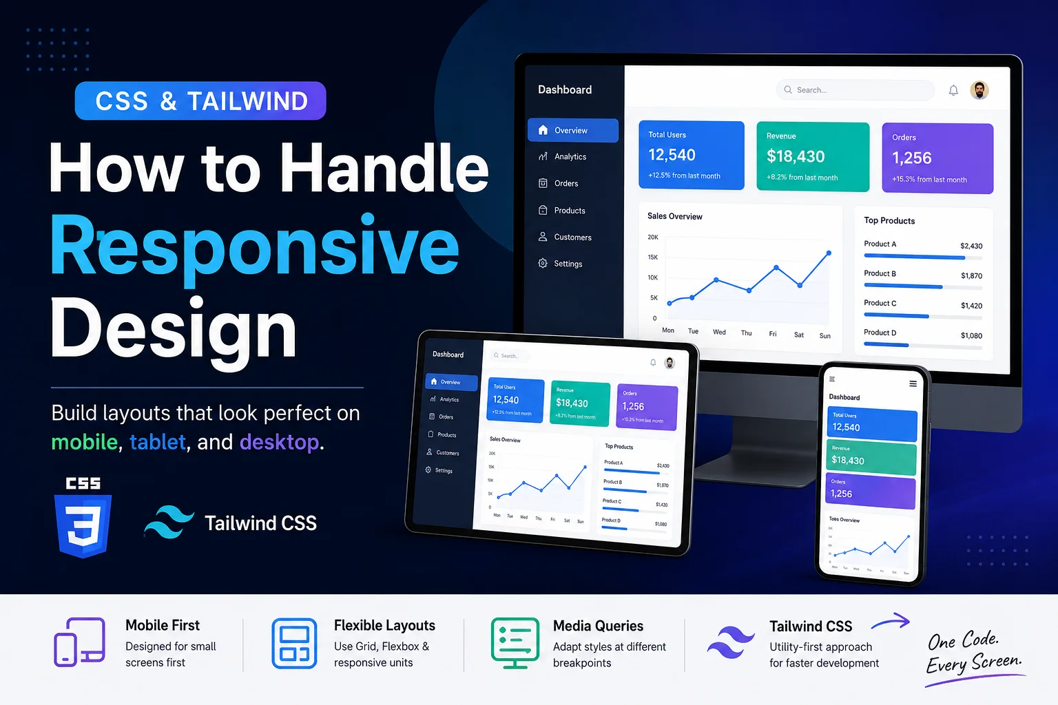
In modern web development, responsiveness is no longer optional—it’s a necessity. Users access websites from a wide range of devices, from small smartphones to large desktop screens.
If your website doesn’t adapt properly, users will face broken layouts, poor readability, and a frustrating experience.
In this guide, you’ll learn how to handle responsive design using both pure CSS and Tailwind CSS, with practical examples you can apply immediately.
What is Responsive Design?
Responsive design means your website layout automatically adjusts based on screen size and device type.
For example:
- On mobile, content stacks vertically
- On tablet, content may split into two columns
- On desktop, full layouts with multiple sections are displayed
The goal is simple:
Build once, make it work everywhere.
Understanding Screen Sizes (Breakpoints)
To build responsive layouts, we define breakpoints—specific screen widths where the UI adapts.
However, it’s important to understand:
These are not strict device categories—they are design-driven thresholds.
Common Breakpoint Ranges
- Mobile: up to 640px
- Small tablets / large phones: 640px – 768px
- Tablets (portrait & landscape): 768px – 1024px
- Small laptops: 1024px – 1280px
- Desktops & large screens: 1280px and above
💡 Key Insight
Devices don’t follow fixed widths anymore:
- Tablets can be 768px or 1024px
- Laptops can be 1366px, 1440px, or 1920px
👉 So instead of designing for devices, design for layout breakpoints.
Part 1: How to Handle Responsiveness Using CSS
1. Add the Viewport Meta Tag
This ensures proper scaling on mobile devices:
<meta name="viewport" content="width=device-width, initial-scale=1.0">
2. Use Media Queries
Media queries allow you to apply styles based on screen size.
✅ Example: Responsive Grid Layout
.container {
  display: grid;
  grid-template-columns: 1fr;
  gap: 10px;
}

/* Tablet */
@media (min-width: 640px) {
  .container {
    grid-template-columns: 1fr 1fr;
  }
}

/* Desktop */
@media (min-width: 1024px) {
  .container {
    grid-template-columns: 1fr 1fr 1fr;
  }
}
✔ Mobile → 1 column
✔ Tablet → 2 columns
✔ Desktop → 3 columns
3. Make Images Responsive
img {
  max-width: 100%;
  height: auto;
}
This prevents images from overflowing their containers.
4. Avoid Fixed Widths
❌ Avoid:
width: 1200px;
✅ Use:
width: 100%;
max-width: 1200px;
Part 2: How to Handle Responsiveness Using Tailwind CSS
Tailwind’s Mobile-First Approach
Tailwind uses a mobile-first system, meaning styles apply to small screens first, then scale up.
Default Tailwind Breakpoints
sm→ 640px and abovemd→ 768px and abovelg→ 1024px and abovexl→ 1280px and above2xl→ 1536px and above
1. Responsive Grid Example
<div class="grid grid-cols-1 md:grid-cols-2 lg:grid-cols-3 gap-4">
  <div class="bg-blue-200 p-4">Item 1</div>
  <div class="bg-blue-200 p-4">Item 2</div>
  <div class="bg-blue-200 p-4">Item 3</div>
</div>
✔ Mobile → 1 column
✔ Tablet → 2 columns
✔ Desktop → 3 columns
2. Responsive Text
<h1 class="text-lg md:text-2xl lg:text-4xl">
  Responsive Heading
</h1>
3. Show / Hide Elements
<div class="block md:hidden">Mobile View</div>
<div class="hidden md:block">Desktop View</div>
4. Responsive Spacing
<div class="p-2 md:p-6 lg:p-10">
  Content here
</div>
CSS vs Tailwind: Which One Should You Use?
Choosing between CSS and Tailwind is not about which is better—it’s about what problem you are solving.
1. Development Speed
- CSS
- Requires writing custom styles
- Slower iteration
- More repetition
- Tailwind
- Faster UI development
- Utility-first workflow
- Less context switching
👉 Tailwind improves developer speed, not runtime speed.
2. Maintainability
- CSS
- Can become complex in large projects
- Naming conventions required
- Tailwind
- Consistent utility classes
- Avoids specificity issues
3. Flexibility & Control
- CSS
- Full control
- Ideal for complex UI logic
- Tailwind
- Highly flexible
- Extendable via config
4. Performance & Bundle Size
- CSS
- Can grow large without optimization
- Tailwind
- Removes unused styles in production
- Results in smaller CSS bundles
5. Readability
- CSS
- Cleaner HTML
- Separated concerns
- Tailwind
- More classes in HTML
- Faster development workflow
✅ Best Practice
👉 Use both:
- Tailwind → layout, spacing, responsiveness
- CSS → custom logic, animations, edge cases
Common Mistakes to Avoid
- Using fixed widths everywhere
- Ignoring mobile-first design
- Writing too many unnecessary media queries
- Not testing on real devices
How to Test Responsiveness
You can test your design using:
- Chrome DevTools → Toggle Device Toolbar
- Resizing your browser window
- Testing on real mobile devices
Conclusion
Responsive design is not just about adjusting layouts—it’s about building flexible systems that adapt naturally across devices.
If your website doesn’t work on mobile, it’s not finished.

Enthusiastic junior full stack web developer with a strong foundation in modern web technologies. Passionate about learning, coding, and building reliable applications.